


Mastering Tableau: From Data Confusion to Dashboard Confidence (Practical Techniques to Transform Raw Data into Powerful Visual Insights)
In the big data age, companies and professionals spend their days wading through seas of spreadsheets, CSVs, databases, and cloud data warehouses.

Introduction: Why Tableau?
- Easy to Learn — Drag and drop your way to charts without coding.
- Connects to Many Data Sources — Excel, databases, cloud services, and more.
- Beautiful Visuals — Create dashboards that look professional and engaging.
- Interactivity — Let users click, filter, and explore the data themselves.
- Fast Performance — Even with large datasets, Tableau handles it smoothly.
In the big data age, companies and professionals spend their days wading through seas of spreadsheets, CSVs, databases, and cloud data warehouses. Raw data is seldom useful in its naked form, though. The true value lies when you transform data into visualization-driven tales that resolve key business issues.
Tableau is one of the leading Business Intelligence (BI) tools in the world, making interactive, stunning dashboards a reality without hardcore coding. Many novices, however, find it difficult to go beyond simple charts to actually insightful, professional dashboards.
Here are a few examples of what’s possible
- Sales Analysis — See which products sell best in each region.
- Trend Tracking — Visualize changes over time, like monthly revenue.
- Maps — Plot data geographically, e.g. sales by country.
- Comparisons — Compare current year vs. last year performance.
- KPIs — Display critical metrics like profit margin or customer count.
Know Your Data
Before building charts, explore your data:
- Check data types (numbers, text, dates)
- Spot missing or unusual values
- Understand the level of detail (daily, monthly, per region, etc.)
Before building dashboards in Tableau, it’s crucial to know your data inside out. Check that your fields are correctly recognized as numbers, text, or dates, so your charts work as expected. Look for missing values or extreme outliers that might skew your results and understand the granularity of your data—whether it’s detailed by day, month, or product—to avoid errors like double-counting. Remove any unnecessary columns to keep your workspace tidy, and if you’re using multiple tables, be clear about how they relate to prevent duplicated or incorrect data.
Drag and Drop Your Way to Charts
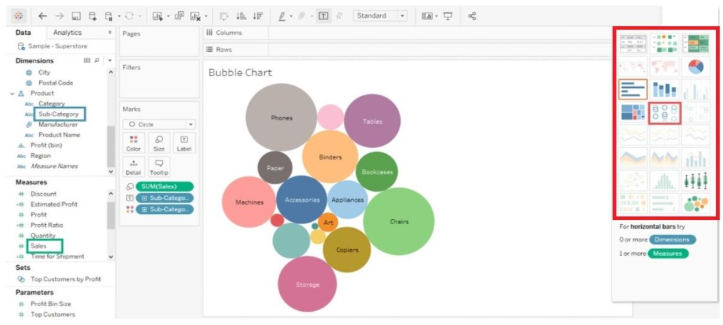
Tableau offers a variety of chart types to visualize data effectively, including bar charts for comparing categories, line charts for trends over time, and pie charts to show parts of a whole. Area charts highlight volume changes, while scatter plots reveal relationships between two numeric variables. Histograms display data distributions, and maps visualize geographic data. Bubble charts add a third dimension with size, heat maps use color intensity to show value concentration, and tree maps represent hierarchical data with nestedrectangles.
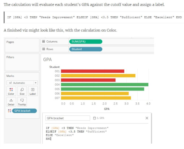
Create Calculated Fields
Creating calculated fields involves defining new data fields derived from existing ones by applying formulas or expressions. These fields allow you to perform custom calculations, transformations, or aggregations within your dataset without altering the original data. Calculated fields enable deeper analysis by combining, manipulating, or summarizing data points to reveal insights tailored to specific business questions or reporting needs.
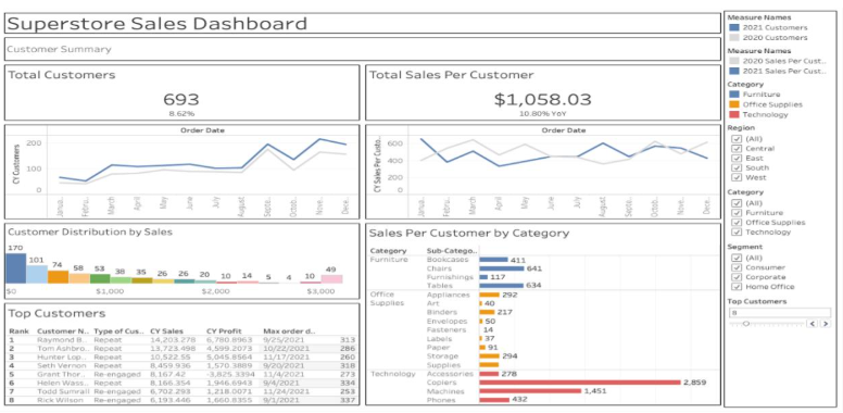
Build Interactive Dashboards
Building interactive dashboards in Tableau means combining multiple charts, filters, and visuals onto a single canvas, allowing users to explore data dynamically. You can add filters, dropdowns, and highlight actions so clicking one chart updates others, creating a seamless storytelling experience. Features like “Viz in Tooltip” let you embed mini charts that appear on hover for deeper insights without cluttering the layout. A well-designed interactive dashboard helps users answer questions on the fly and discover trends they might otherwise miss, making data exploration engaging and intuitive.
Conclusion
Mastering Tableau transforms overwhelming data into clear, interactive stories that drive smart decisions. By understanding your data, creating calculated fields, and building engaging dashboards, you unlock the true power of visual analytics.
In the end, mastering Tableau isn’t just about learning features—it’s about transforming how you see and share your data. With the right techniques, you can turn confusion into clarity and build dashboards that truly make an impact. Keep exploring, practicing, and letting your data tell powerful stories.